UX design is not Figma
Whenever an upcoming designer asks me for advice, it’s usually: “Where can I learn Figma?” The idea that design is just about mastering Figma has taken over the industry, leading to many designers with only surface-level skills. Sadly, many only realize later on in their careers that while they know how to design, they can’t solve the problems they’ve been hired to fix.

Figma is just a tool to help showcase your UX skills. So, what else do you need to be a great UX designer?
1. Understand the Problem
Skipping this step can result in designing the right solution for the wrong problem. Many companies waste millions on new products only to discover that users aren’t interested in them.
Steps:
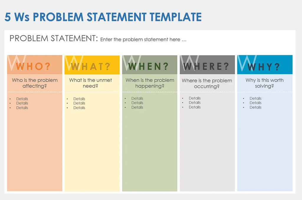
- Ask the 5 Whys — Figure out the Who, What, When, Where, and Why. This helps you fully understand the problem you’re tackling. Let the stakeholders answer these questions, as they own the product. It’ll save you from being told to rework everything later because it doesn’t align with their mission.

- Customer Problem Statement —Put yourself in the shoes of the customer and define the problem. This will ensure you’re solving for the customer, not just for the company.
2. Do Some Research — It Won’t Bite;)
Today, any product without data to back it up is seen as risky. The same goes for design. To ensure you’re on track, you need to research to validate the solution you want to design.
For solo projects, check existing data online before diving in. If you can talk to real customers — then that’s better! You can gather qualitative and quantitative insights through interviews or surveys.

Got a big audience? Tools like Dovetail can transcribe interviews and highlight the key insights you need for your project.
Also, if your stakeholders are slow-moving, showing them data can help push things forward!
3. Brainstorm Solutions
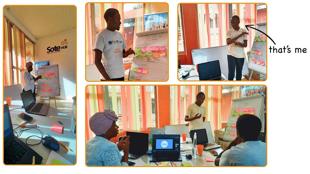
When brainstorming, use tools that your team can easily follow. Skip Figma for now😉. Bring out the paper, markers, and a whiteboard. Let everyone share their ideas, no matter how wild they sound! Including everyone at this stage ensures that the whole team, not just you, are aligned with the solution.

4. Hot Potato Handoff
You might be tempted to design the whole product and then hand it off to stakeholders. However, this can lead to designing for yourself and not for them.

To avoid this, try the “hot potato” method: after designing a few key screens or flows, share them with the developer or stakeholders for feedback as you continue working on the rest. This may not work in every environment, like in fast-paced corporate settings, but when possible, it can save you a lot of headaches!
Psst!: This is just a high-level overview of what you need to grow your UX career. I’ll be sharing more tips, so stay tuned! 😉
And remember, don’t let anyone tell you you can’t succeed. Be unique in how you design your products!
UX design is not Figma was originally published in Bootcamp on Medium, where people are continuing the conversation by highlighting and responding to this story.
