Sote Hub
Project Overview
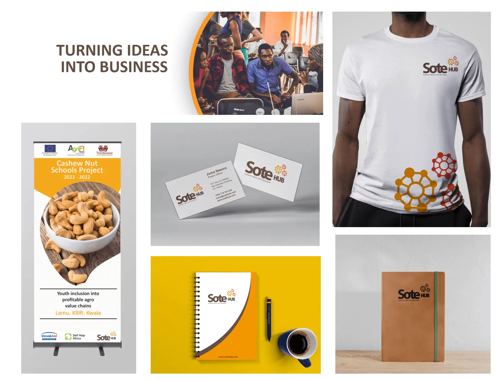
Sote Hub is a non-profit organisation that deals in startup acceleration programs and provides consultancy services to businesses across Kenya. The primary users of their website are startups, business owners, and donors.
The challenge
The organization has grown over the last few years. Previously, the organisation concentrated on enabling students in universities and high schools to identify their startup ideas early and access business education. The organisation saw the need to revamp the site to show its expansion in providing consultancy services and acceleration programs.
Goals
Our Goals for the redesign were:
- Get businesses and startups to know the current services the organisation is providing.
- Capture the impact it's creating on the community.
How was the problem tackled?
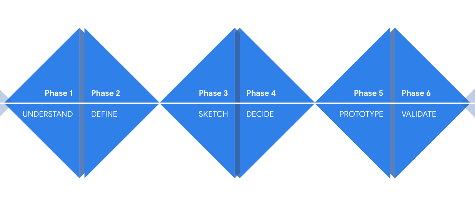
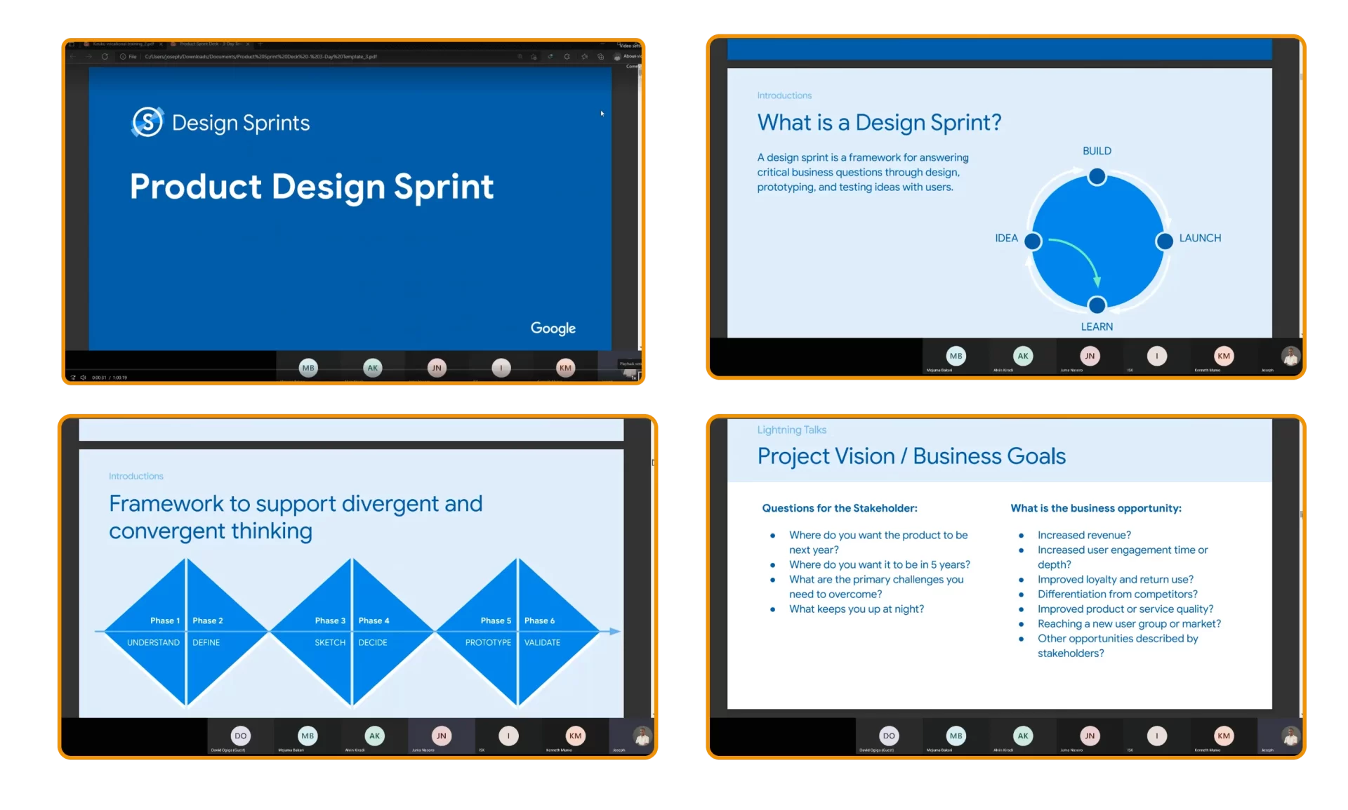
We agreed to move forward to do the research through a design sprint that helped us answer critical design business questions through Understanding, Defining, Deciding, Sketch, Prototyping and validating the solution with users.
Understanding
As the sprint master, I ensured that each department was presented for the physical sprint. I debriefed everyone on what was expected from them in advance before the beginning of the sprint so that they could clear any pending projects for the next few days.For this first stage, we did it online to involve high-level key members since they were not available physically.
Empathy Map
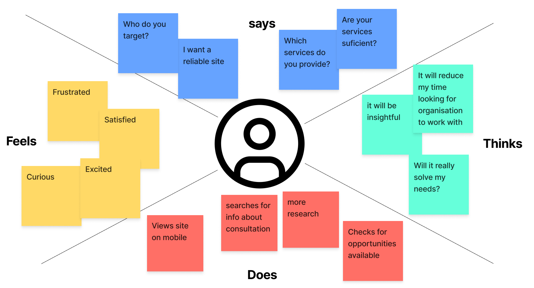
An empathy map with the four quadrants of says, Feels, thinks and Does was created to understand our users' needs.
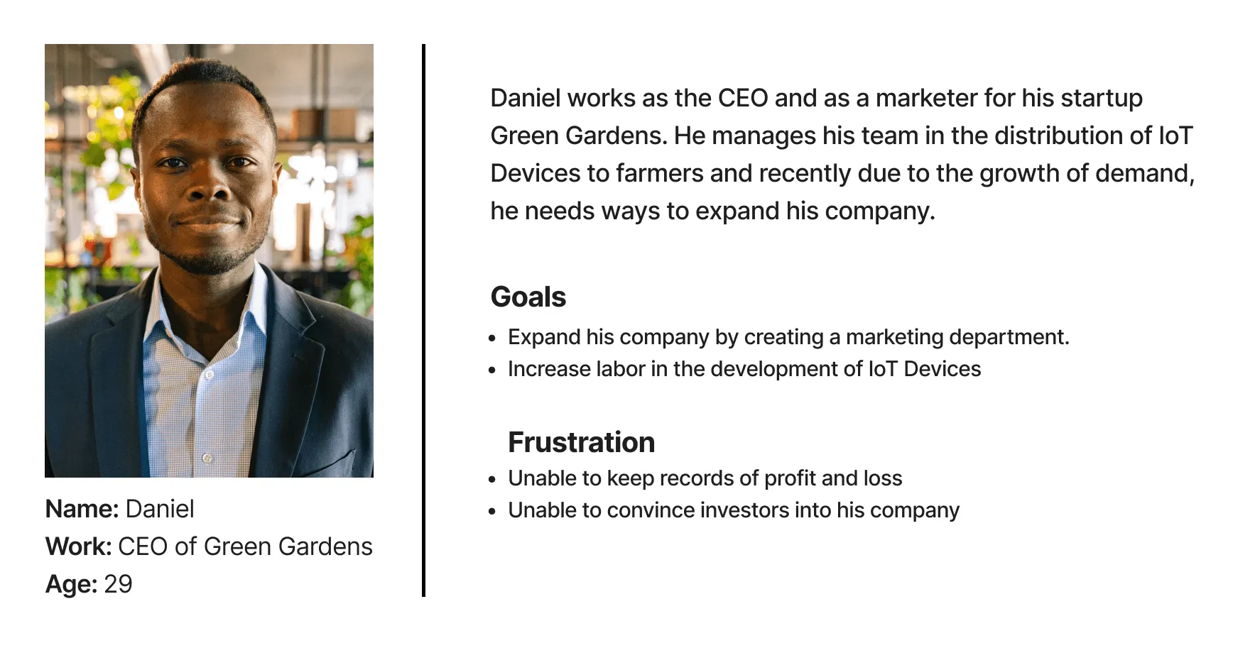
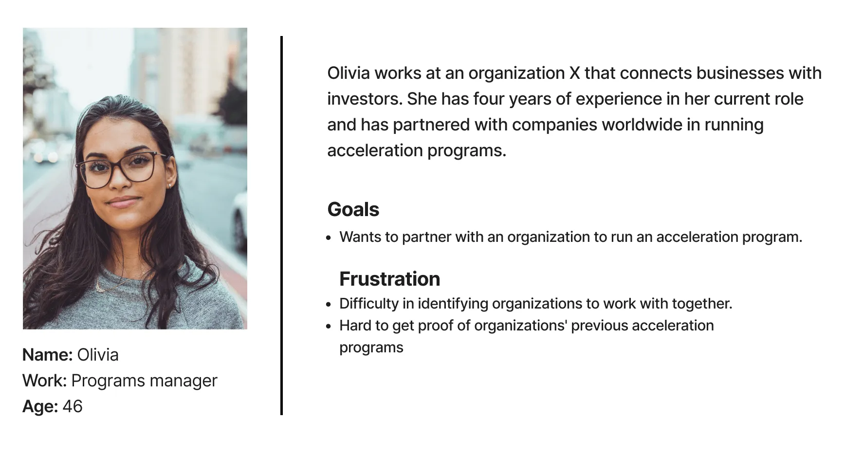
User Persona
Ideation and deciding which solution to build
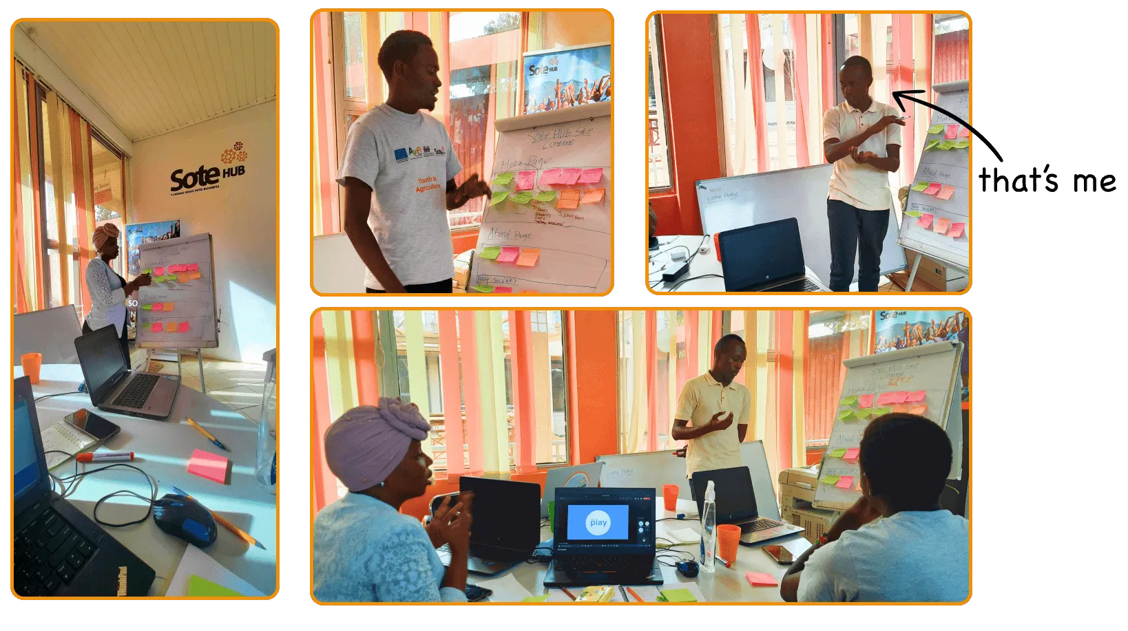
Each member had an opportunity to write their ideas on a sticky note and later expound more to the team. I’d say the best ideas came from a non-tech team. The team put all the notes on a whiteboard for easy access for prototyping and testing.
I’d say this was one of the most exciting steps for the team. 😊
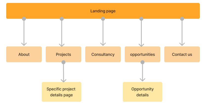
User Flow
Sketching
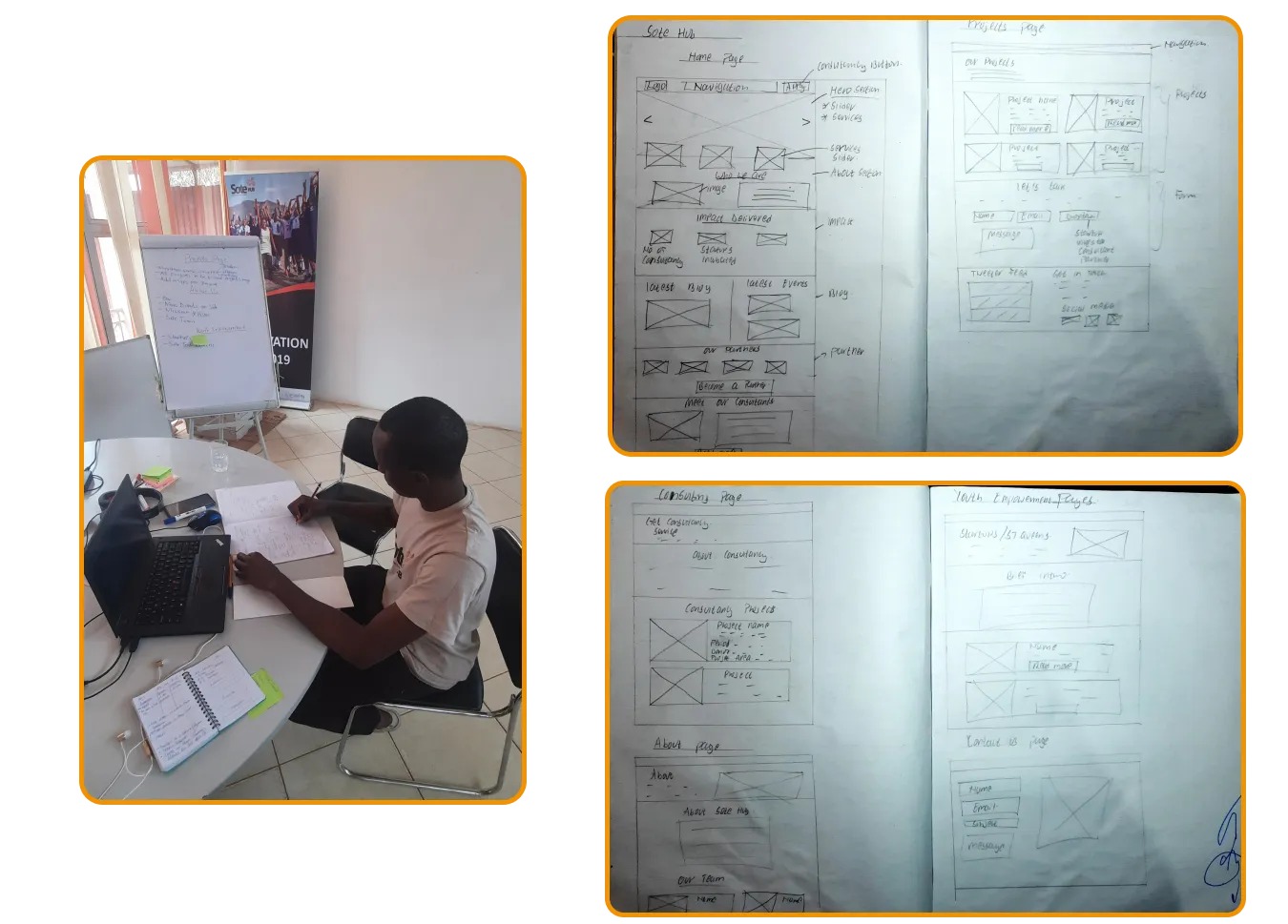
After the brainstorming session, we started off sketching the redesigns in notebooks. I’d say this step went off smoothly as we just referenced the ideas the team suggested in the earlier stage of a design sprint.
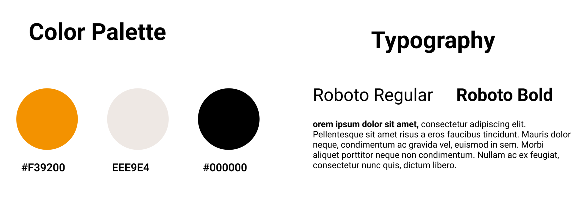
Brand Guide
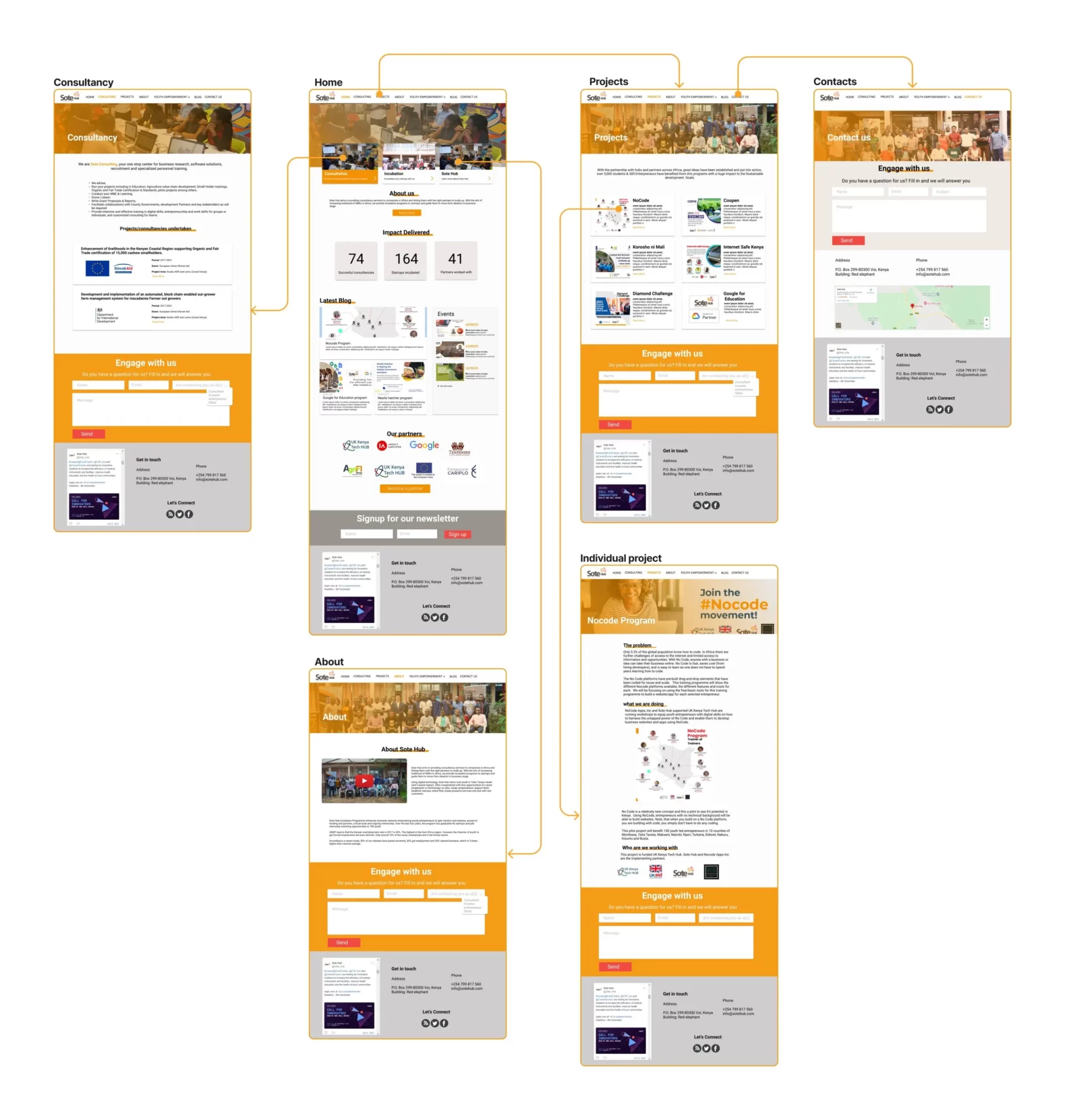
High Fidelity Designs
Using Figma, we designed each page and prototyped it for testing. Then, I shared it with the team for suggestions and did iterations.
Outcome
The site was developed using WordPress, tested, and released to the public. Iteration continues as we receive feedback from the users.
Challenges
A design Sprint usually takes around five days. However, in our case, it took more time to do high-fidelity and web development due to other high-priority tasks that needed to be completed.
Am currently not with the team but I'd have used Google Analytics to measure the metrics if the site visits have improved.
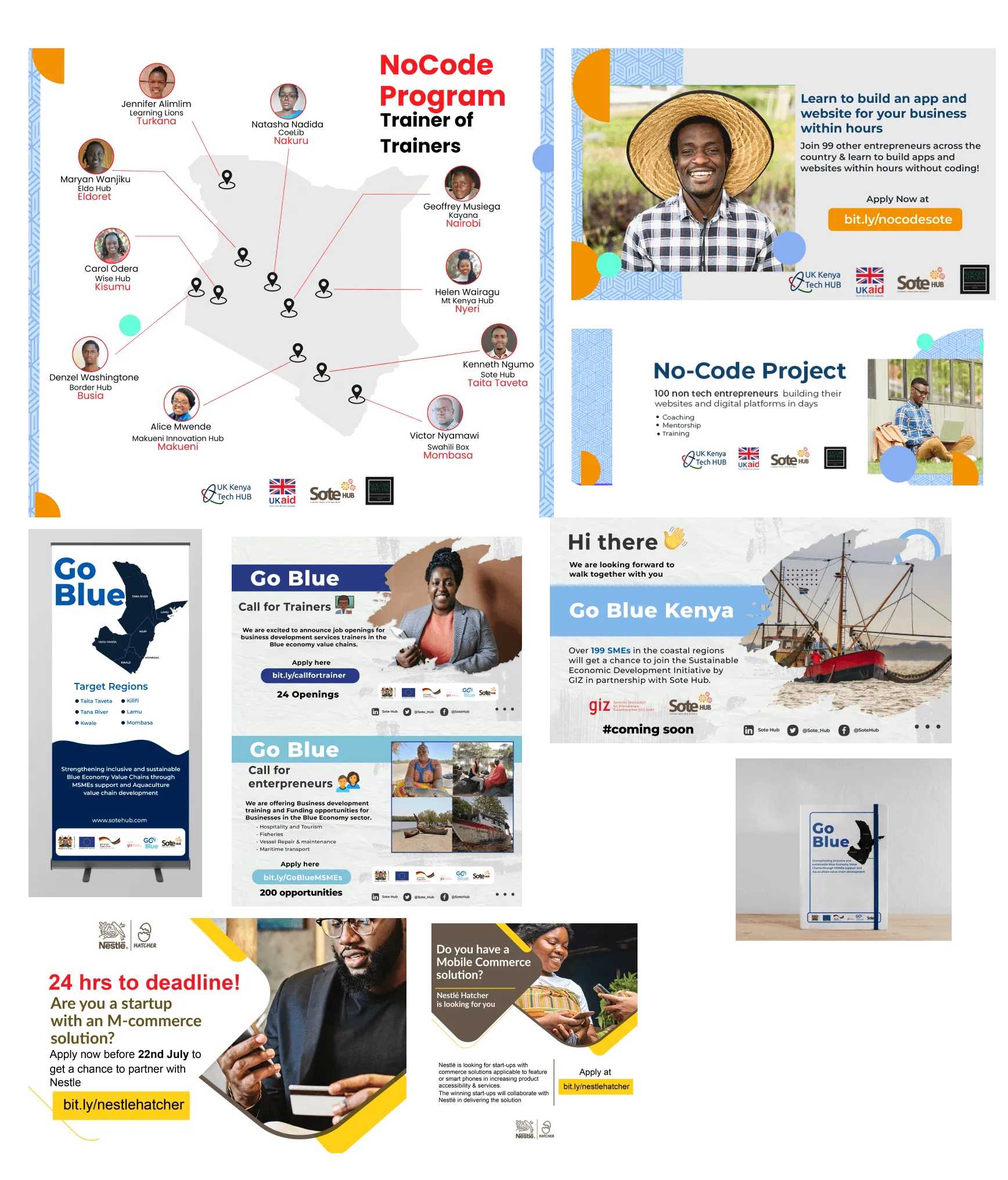
Other Work with Sote Hub
