Tree Map
The Problem
Many organizations and individuals come together in the fight against climate change by planting trees in affected areas. The projects are usually of good faith; however, over time, they are unable to keep track of the below data:
- Number of trees planted in specific locations
- Dates for planting
- Tree species name
- Names of Individuals/organizations who planted specific trees
Furthermore, there is no platform in Kenya where individuals/organizations can share this data as a hub to the public. This issue has led to their effort not being seen, making it hard to create awareness and quantify their reduced carbon footprint.
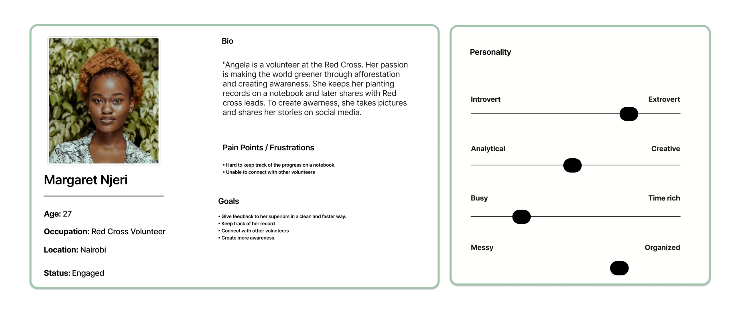
Persona
Created a persona from the data collected to guide me in understanding the platform's usage and maintaining track.
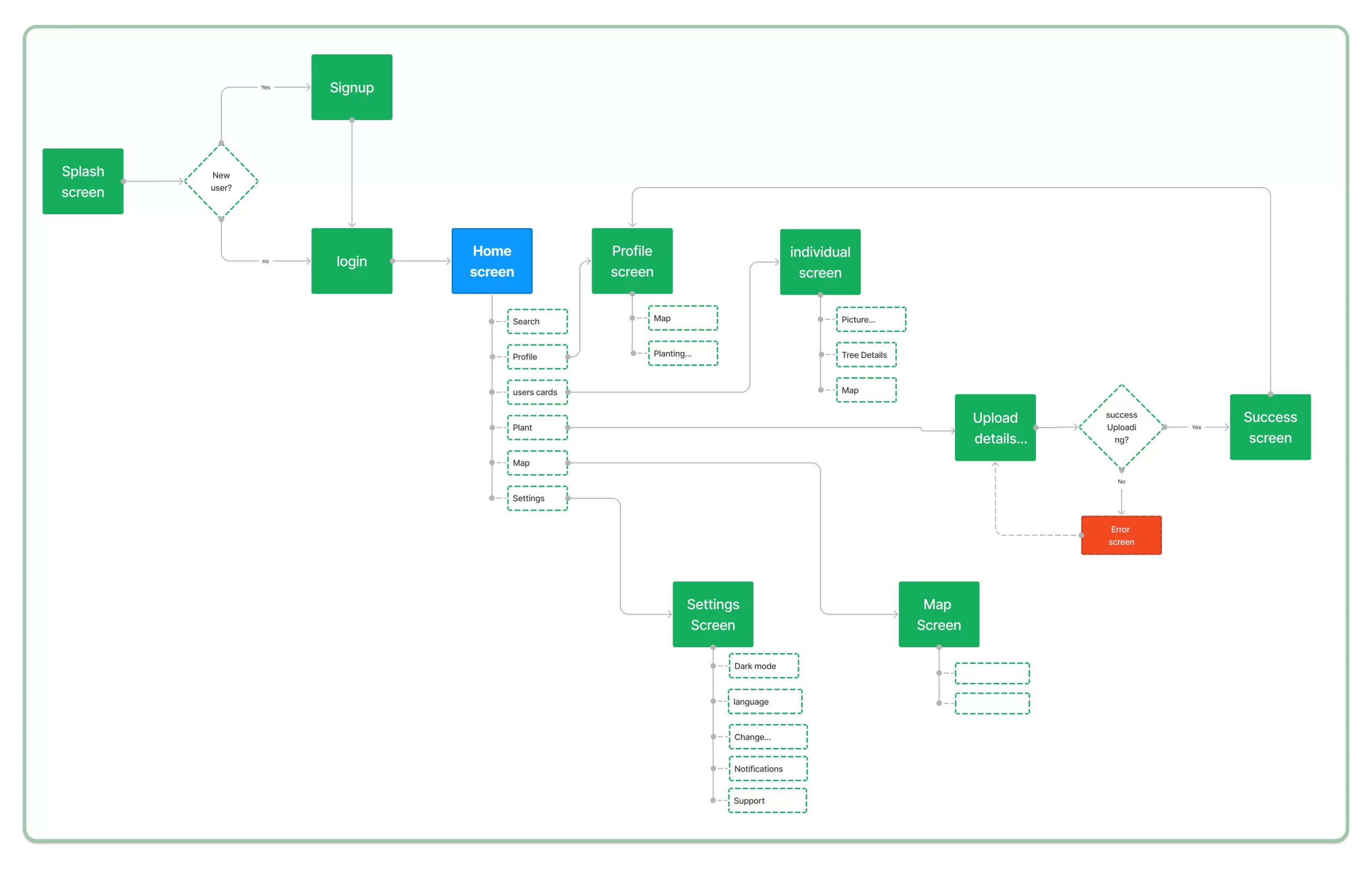
User Flow
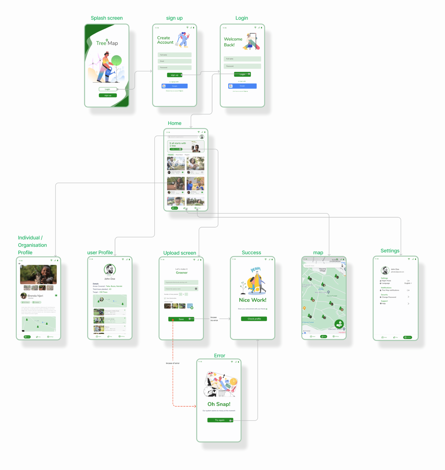
To better understand the app's flow, I designed a user flow that assisted in identifying which screens to create in my next sketching phase.
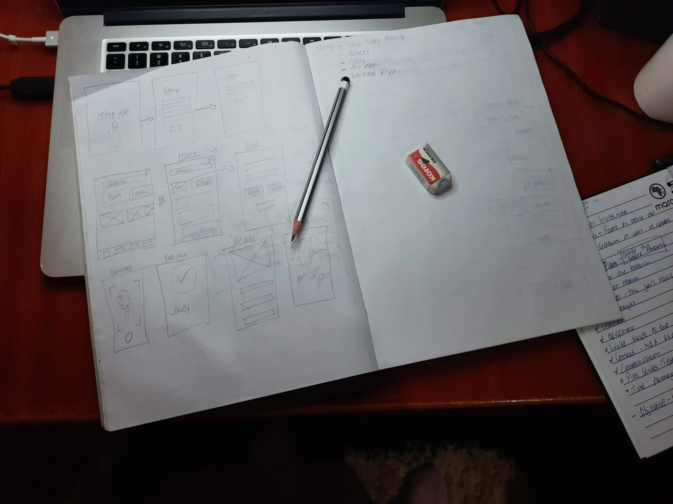
Low Fidelity Sketches
Before any clean design, I usually start with some sketches in my notebook to brainstorm on various components I can put on the screens.
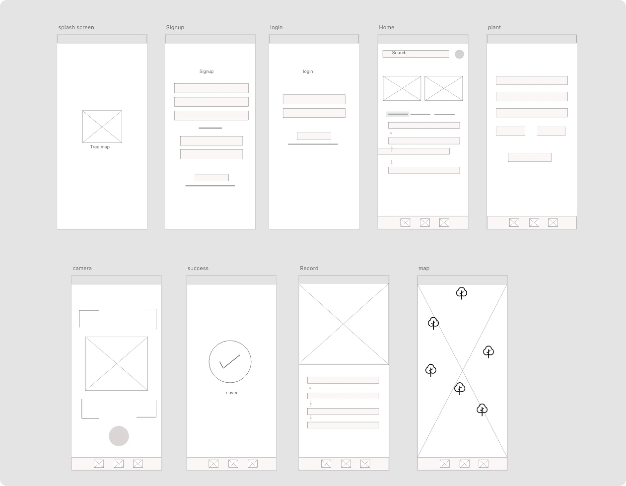
Low Fidelity wireframes
From the Sketches, I came up with some Lo-fi Wireframes using Adobe XD.
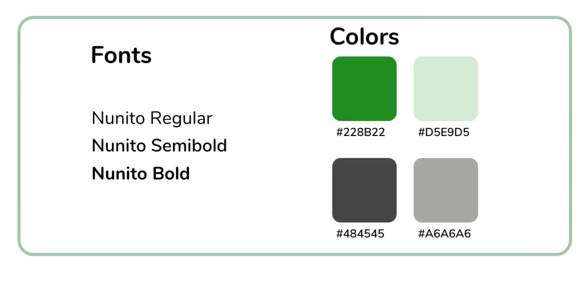
Font and colors
For easy identification that the platform revolves around nature, we decided to use variations of green as the primary colors and grey.
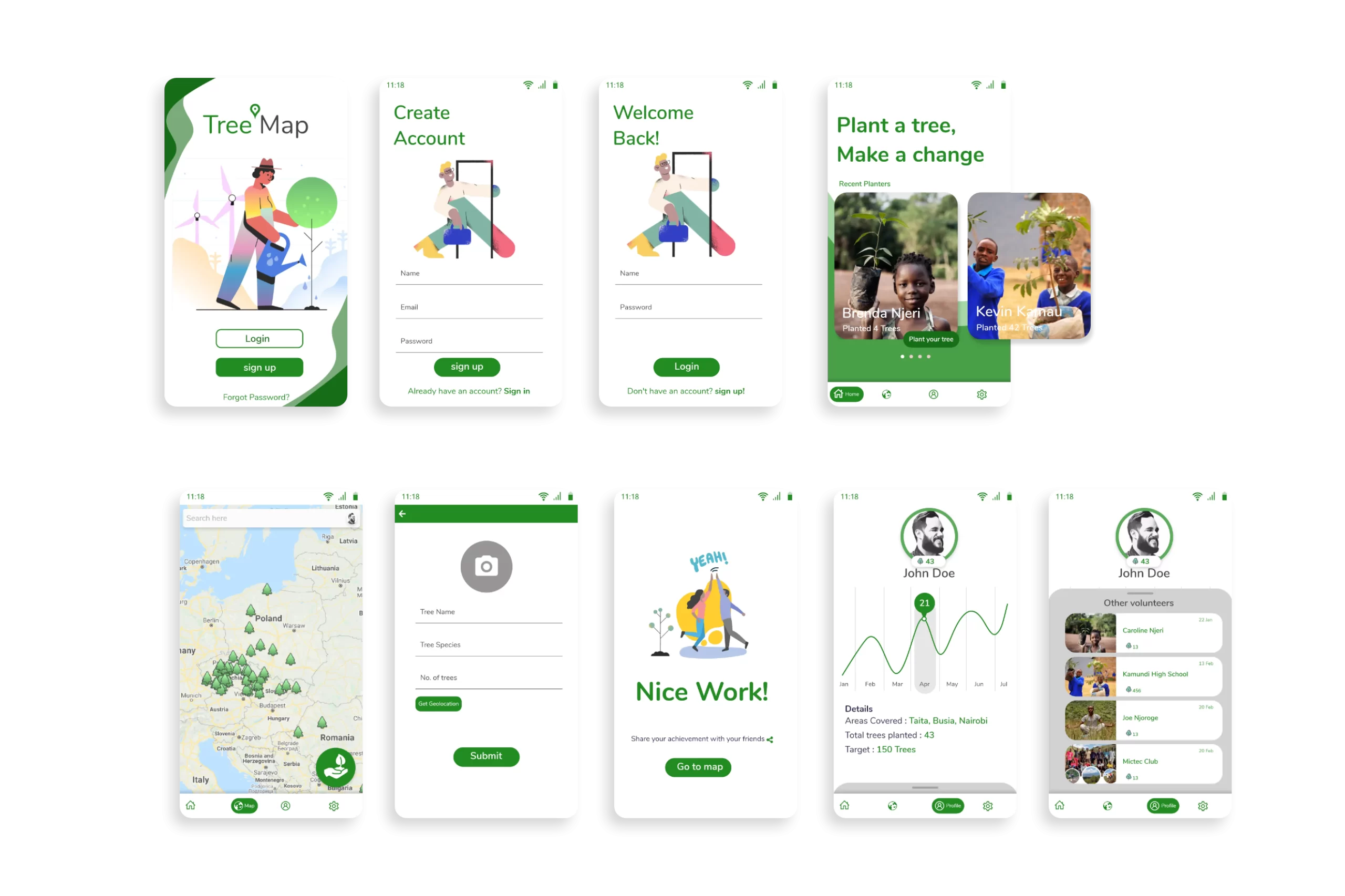
High-fidelity designs and User Feedback
From the sketches and colour guides, I designed high-fidelity designs using Adobe XD and Photoshop.I later shared the designs as an interactive prototype with some participants willing to test it out.
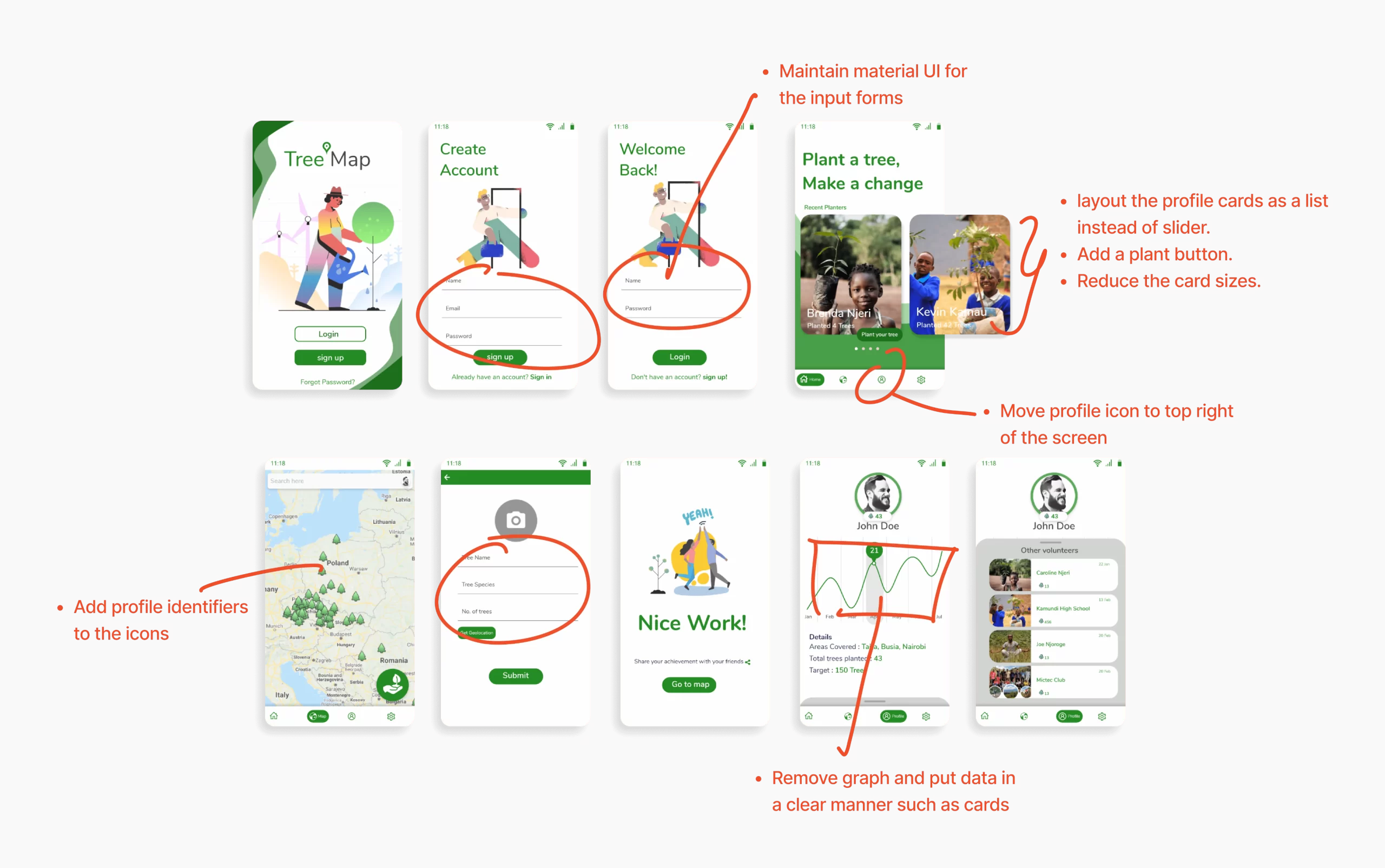
Usability Testing
Let's say the first design didn't come out as expected 😅. From the user's Feedback, they faced several challenges while interacting with the prototype.
challenges included
- ❌ The buttons on the Home screen are misdirecting.
- ❌ You have to scroll vertically to access a specific profile on the Home screen
- ❌ Unable to interpret the graph on the profile screen.
- ❌ The forms are hard to identify
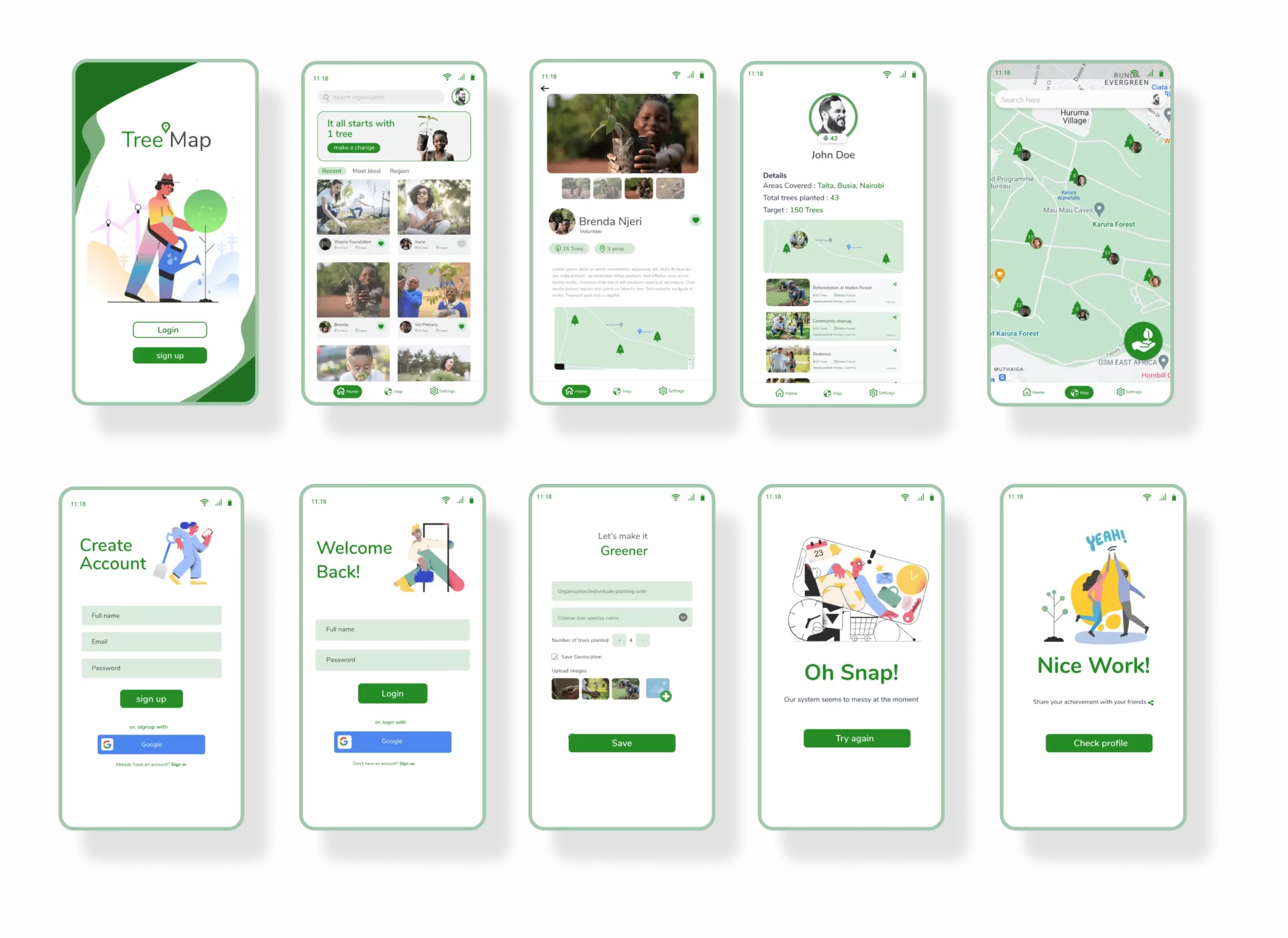
Design 2.0 after iterations
A good designer should always empathise with the users, take feedback positively, and iterate the designs according to the feedback. That is what I did and below are the final results.
Lessons learnt
I used a lot of time and energy in redesigning the app. I realized that it could have been better if we first shared the low fidelity design with users to get feedback before proceeding to high fidelity designs.
Also, we didn’t prepare well to do qualitative research, and we plan to create a research plan checklist next time, as suggested in one of the IXDF courses – User Research and best practices.
