Tree Map
Groups across Kenya plant trees to fight climate change, but they lose track of what was planted, where and by whom. Tree Map gives that data a public home.
- Role
- UX designer
- Year
- 2020
- Tools
- Adobe XD, Figma, Photoshop

The problem
Organisations and individuals plant trees in good faith, but over time they can’t keep track of:
- How many trees were planted, and where
- When they were planted
- The species
- Who planted them
There was no platform in Kenya for sharing this data publicly, so these efforts went unseen, and it was hard to raise awareness or quantify the carbon impact.
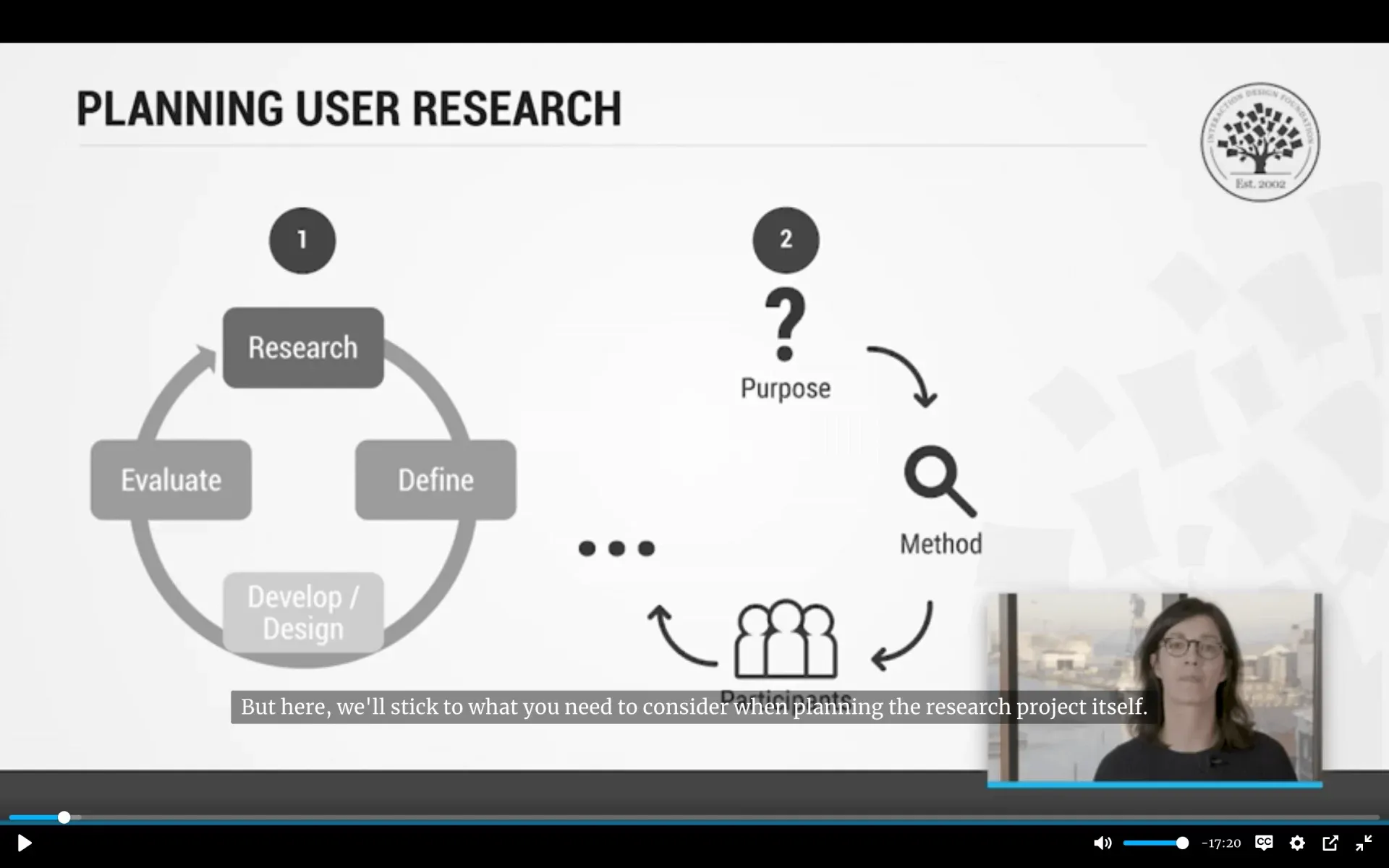
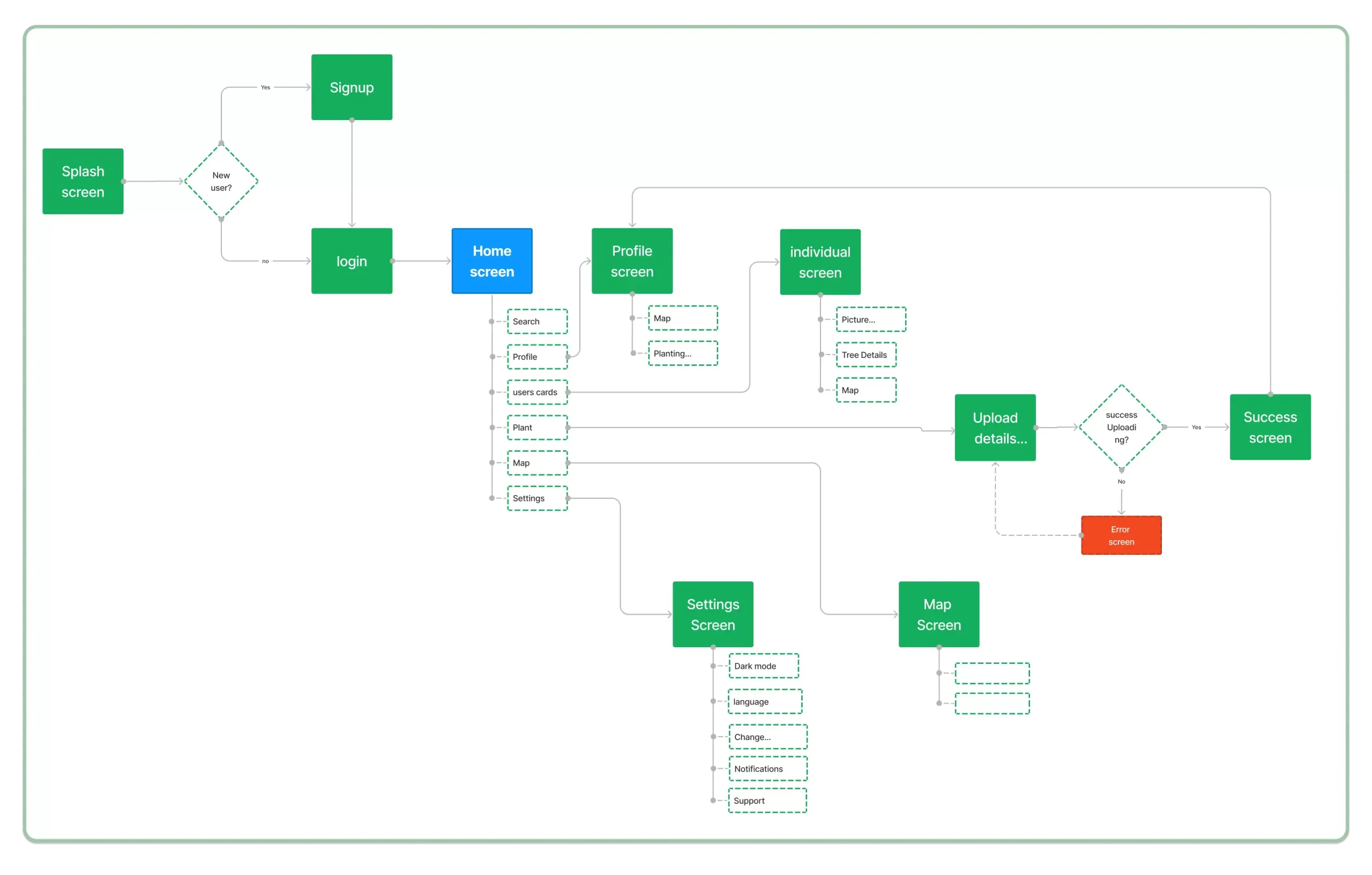
From persona to flow
I turned the research into a persona, then mapped a user flow to decide which screens to sketch first.
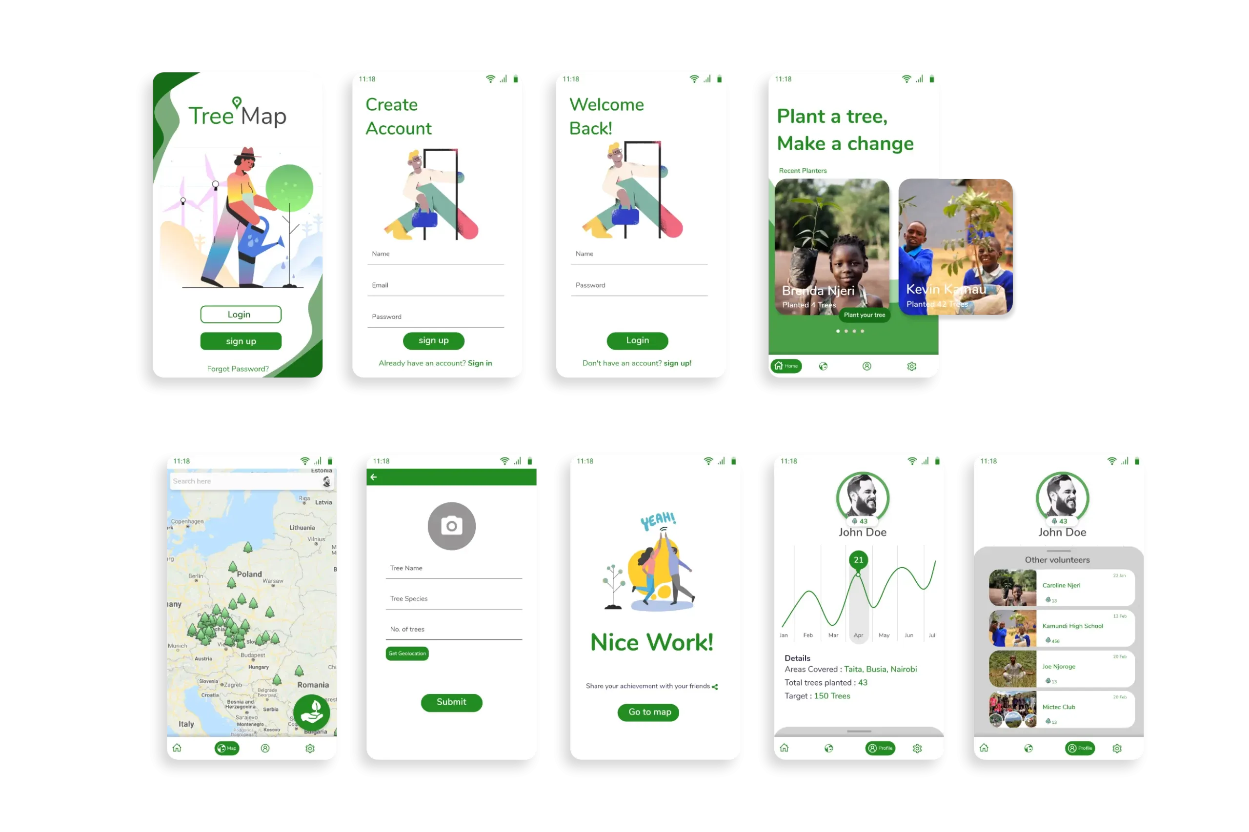
First design and usability testing
I moved from sketches to lo-fi wireframes to hi-fi designs, then shared an interactive prototype with participants. It didn’t land as expected. People said:
- The home screen buttons were misleading.
- You had to scroll vertically to reach a specific profile.
- The profile graph was hard to read.
- The forms were hard to spot.
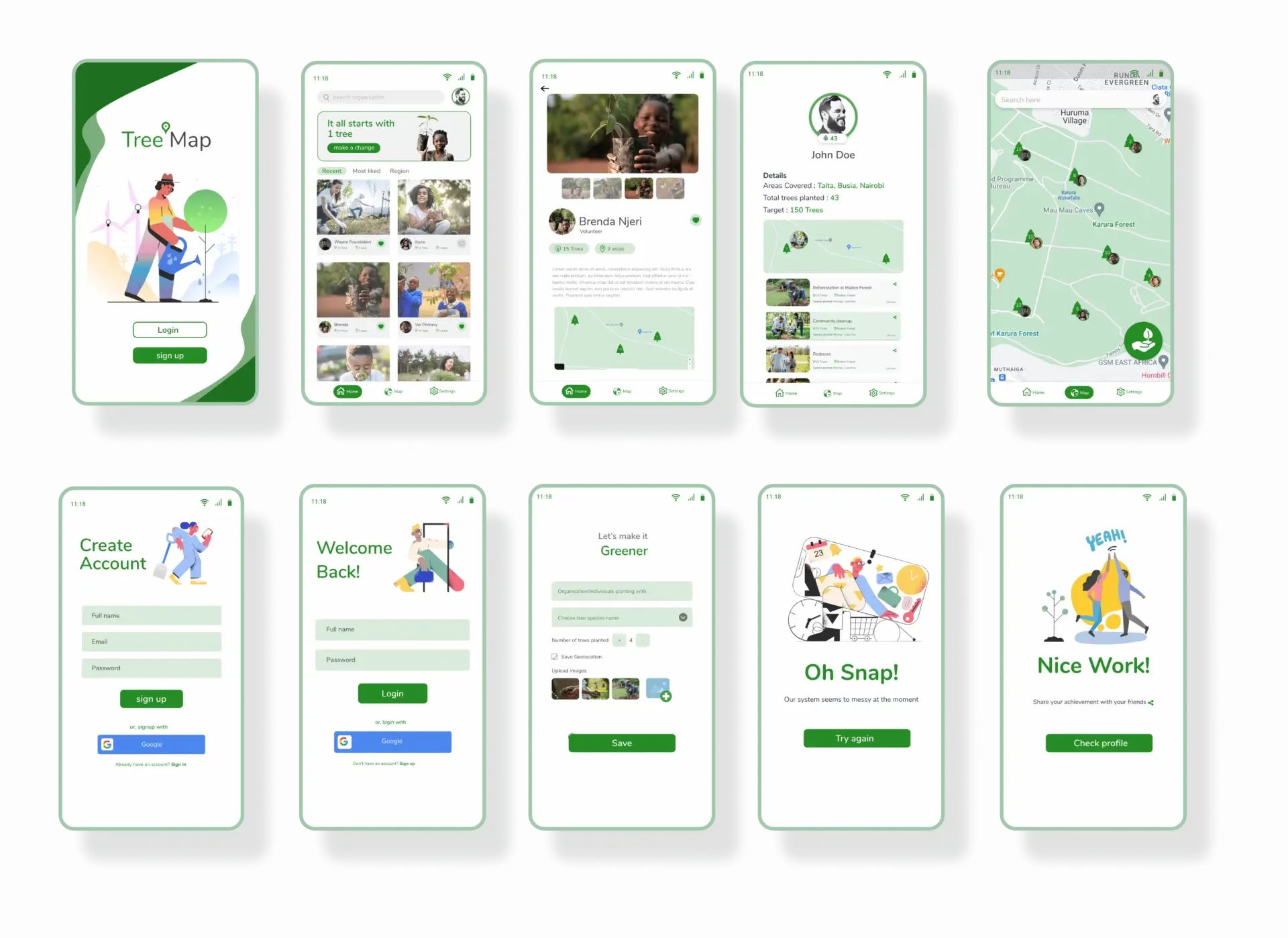
Design 2.0
A good designer takes feedback positively and iterates. Here’s the redesign after addressing each issue.
Lessons learnt
I spent a lot of time redesigning at high fidelity. Testing the low-fidelity designs with users first would have saved much of it. Next time I’ll also plan the qualitative research up front with a proper research checklist.
